Stillwaters
Contracting & Design
A thoughtful rebrand for a business built on careful craftsmanship.
Brand Strategy · Naming · Visual Identity · Messaging · Creative Direction
Thoughtfully planned.
Carefully built.
Client
Stillwaters Contracting & Design
Industry
Residential Contracting, Renovation & Design
Project Scope
Brand Strategy, Business Naming, Visual Identity Refinement, Brand Messaging, Practical Brand Applications
Creative Direction
Christie Cahill
Stillwaters Contracting & Design needed more than a visual update. The business had outgrown its original name and needed an identity that better reflected the way the work itself is approached: calmly, thoughtfully and with attention to every detail.
Originally operating as Forefront Home Solutions, the company had been built around dependable workmanship, practical knowledge and a genuine commitment to helping homeowners improve the spaces they live in.
As the business developed, the original identity no longer fully represented the quality of the work, the experience behind it or the direction in which the company was growing.
The company needed a brand that felt more distinctive, established and intentional—without becoming overly corporate or losing its personal, hands-on character.
The original business name was functional, but broad. It sounded similar to many companies in the home-services industry and did not communicate a clear personality or point of difference.
At the same time, the existing tree-and-reflection symbol carried genuine meaning and remained an important part of the company’s story.
The challenge was not to discard everything that came before.
It was to preserve the strongest and most meaningful elements while building a more complete brand around them.
Brand Requirements
Quiet
Confidence
The strategy positioned Stillwaters away from generic contractor branding and toward a more thoughtful, considered customer experience.
Instead of relying on aggressive construction imagery or predictable industry language, the identity would reflect the qualities homeowners genuinely want when inviting someone into their space: trust, care, clarity, experience and follow-through.
Thoughtful Planning
Every successful project begins with listening, understanding and considering the details before construction begins.
Careful Craftsmanship
The quality of the finished work depends on the decisions, preparation and care that happen throughout the process.
Calm Professionalism
Renovations can feel disruptive. The Stillwaters brand was designed to present the business as a steady and reassuring presence from the first conversation through completion.
STILLWATERS
A name
with depth.
The name Stillwaters communicates steadiness, depth, calm and trust.
It suggests a business that does not rush important decisions, overlook the details or take unnecessary shortcuts.
The name also connects naturally with the original tree-and-reflection symbol. The imagery of still water and a tree planted beside a stream carries a subtle Christian meaning—faith expressed quietly through the quality, character and integrity of the work.
The symbolism is present without needing to be heavily explained, allowing the brand to remain welcoming and relevant to a broad customer base.
Adding Contracting & Design provides clarity while leaving room for the business to serve clients across renovation, construction, planning and design-focused projects.
Preserving the meaning.
Refining the system.
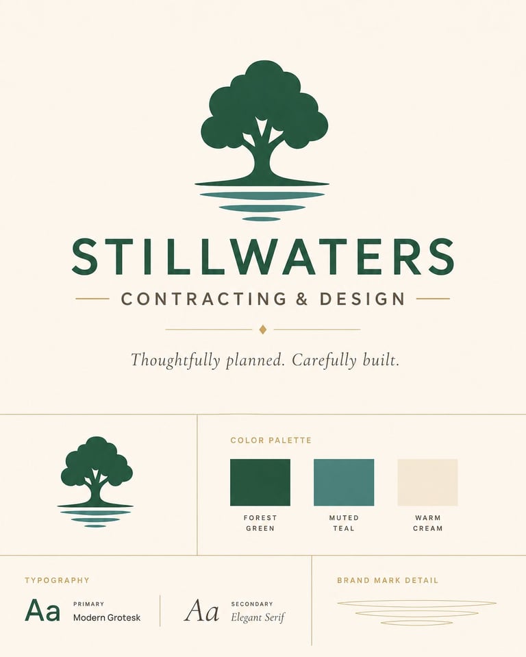
The original rounded tree and mirrored reflection were intentionally preserved. Rather than replacing the most meaningful part of the existing identity, the surrounding brand system was refined to give the symbol greater purpose, clarity and flexibility.

The tree represents strength, growth, experience and work built to last.
The reflection connects the symbol to the Stillwaters name while subtly representing the idea that a person’s values should be reflected through their work.
The tree silhouette is also provided as a single-colour asset for tool stickers, signage, embroidered workwear and small-format applications where simplified mark recognition is essential.

Colour Palette
Forest Green
Permanence, craftsmanship and natural strength.
Muted Teal
Calm, clarity and the reflective qualities of water.
Warm Cream
Warmth, approachability and refinement.
Clean, confident typography balances the organic shape of the tree. The result feels professional and established while remaining approachable enough for a personal, service-based business.
THOUGHTFULLY
PLANNED.
CAREFULLY
BUILT.
The tagline brings the entire brand strategy into one clear promise. It communicates that care is present both before and during the physical work. Projects are not simply completed—they are considered, planned and built with purpose.
The wider brand voice is calm, clear and reassuring. It avoids unnecessary industry jargon, exaggerated promises and aggressive sales language. Instead, the messaging focuses on experience, communication, craftsmanship and trust.
Designed for
the real business.
The identity was created to work in the places where the business actually operates—not only on a website. Below is a representative selection of where the brand system was designed to live, and where additional assets are being developed.
Tool-Sticker Direction
- The original tree-and-reflection icon
- Forest green
- Muted teal
- Warm cream
- A practical cream contour-cut border
From a broad home-services identity to a distinctive brand built around thoughtful craftsmanship.
Before
Original Identity
Forefront Home Solutions presented the business as a general home-services provider, but the identity did not communicate a distinctive personality, design perspective or clear long-term direction.
After
New Identity
Stillwaters Contracting & Design presents a clearer and more memorable identity built around thoughtful planning, careful craftsmanship and calm professionalism. The rebrand gives the company a stronger name, message and visual foundation for future growth.
A brand built
to grow.
The completed direction gives Stillwaters Contracting & Design a cohesive brand foundation that feels established, personal and adaptable.
It preserves the meaning already present within the business while creating a more intentional identity that can grow across contracting, renovations and design services.
This was not simply a visual update.
It was the process of identifying what the company already stood for—and ensuring the brand finally communicated it.
Christie Cahill led the brand strategy, naming direction, messaging development and creative refinement of the Stillwaters identity.
The project combined strategic positioning with practical design thinking—creating a brand that reflects the character of the business while remaining functional across real-world applications.
Is your business better
than your branding suggests?
A strong business can outgrow the identity it started with. The right rebrand does not erase what you have built. It clarifies it, strengthens it and prepares it for what comes next.